Data Prep
Impact of UX — Redesigning Engineering-Built Workflows
The Data Prep application helps users seamlessly ingest, prepare, and manage client reporting data. It is a critical tool in the FactSet workflow — enabling analysts and operations teams to transform raw data inputs into structured, report-ready outputs.
UX Designer embedded in a cross-functional team. I led discovery, redesign, and usability testing for engineering-built features that had accumulated usability debt over time.
Certain functionalities within the application, originally implemented by the engineering team, became less user-friendly over time. This project aimed to redesign those experiences and make them more intuitive — validated through direct usability testing with real users.
Discovery sessions with users and stakeholders surfaced four recurring pain points:
- Difficulty Identifying Document Types: Users struggled to distinguish between different document configurations at a glance, leading to selection errors.
- Data Loss During Editing: Navigating between steps in the document setup flow caused unsaved changes to be silently discarded.
- Low Transform Function Usage: A powerful feature was underutilised because users couldn't discover or understand it within the existing interface.
- Inconsistent and Confusing Interface: The UI mixed interaction patterns, toolbar placements, and navigation structures in ways that conflicted with user mental models.
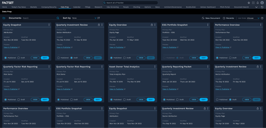
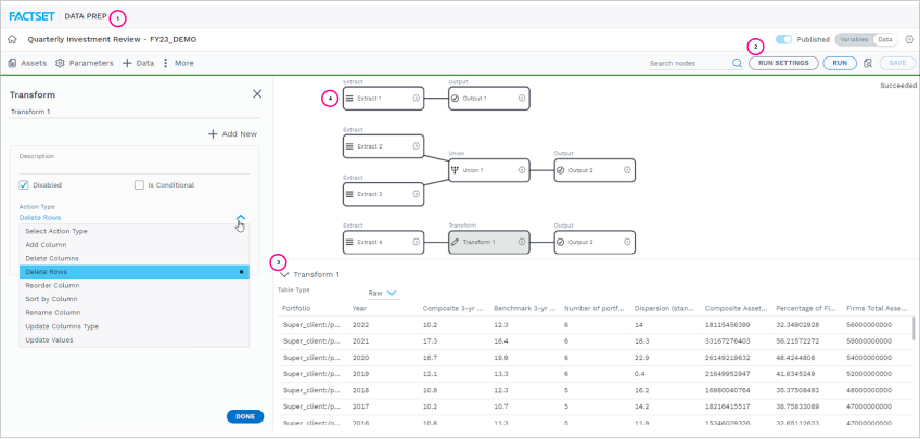
- Confusing interaction elements
- Inconsistency with familiar interfaces
- Lack of clear distinctions
- Inconsistent Navigation
- Unclear IA — Toolbar
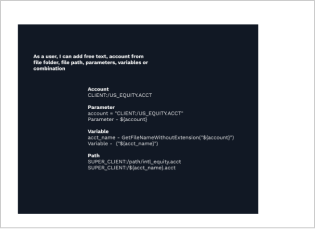
- Errors in Parameter inputs & Data Loss
- Visual representation of nodes
Before redesigning individual screens, I mapped the full document creation workflow to understand where friction compounded across steps. The key flow is linear but users frequently need to navigate back — which is where data loss was most acute.
With the workflow mapped, I identified which design problems occurred at each step and prioritised them by user impact and implementation feasibility.
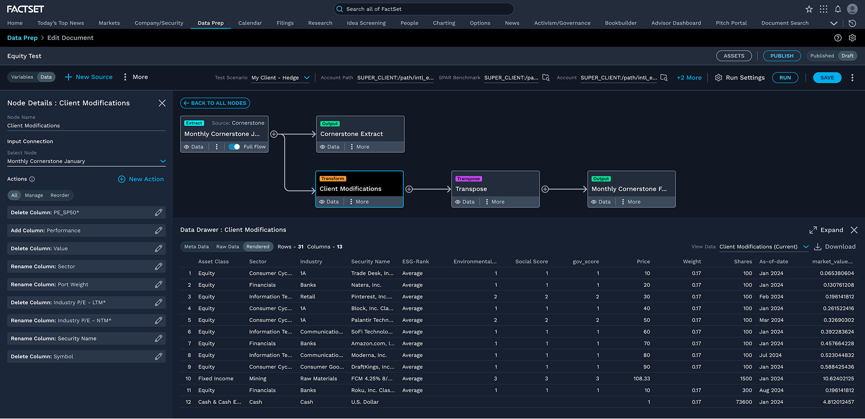
The node editing experience had no validation feedback at input time, and navigating away discarded unsaved parameter changes without warning. Users frequently lost work without realising it until the downstream report failed.
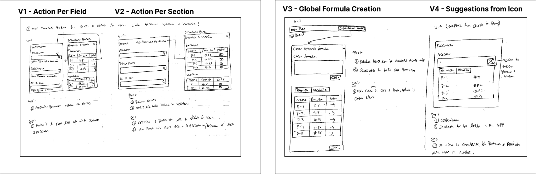
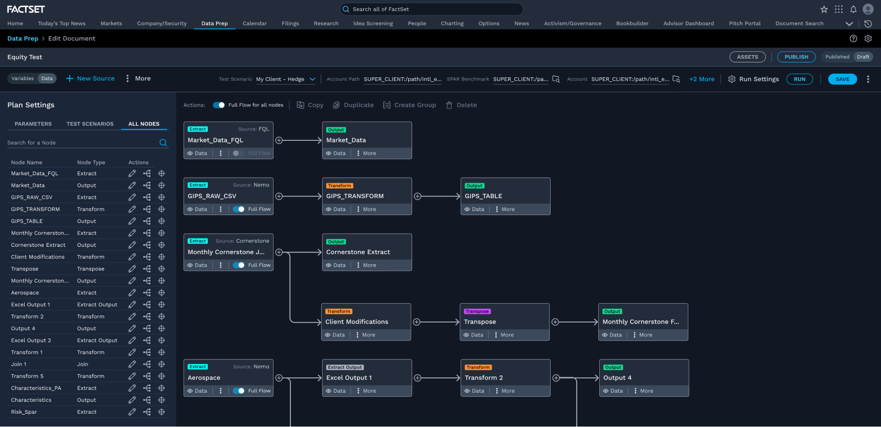
The redesigned interface addressed each identified problem systematically — aligning to Fusion Design System guidelines and validating interaction changes against user mental models.
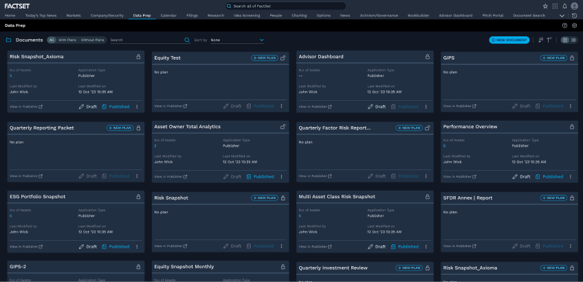
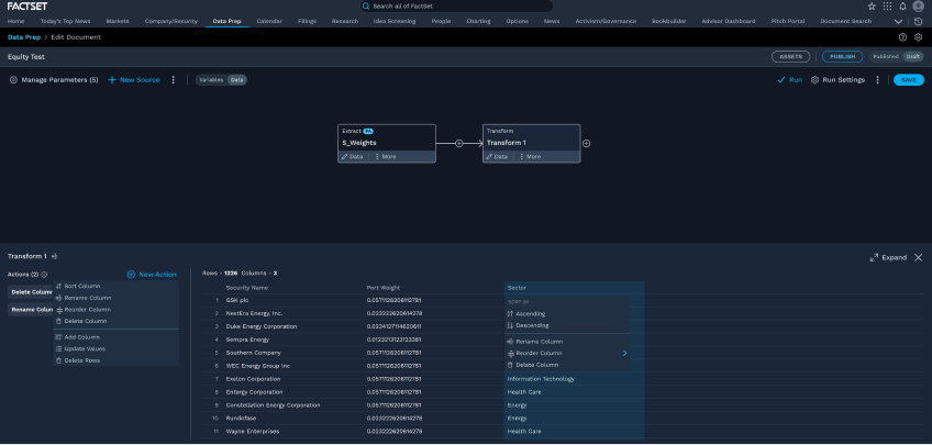
- Simplified Interaction
- Consistent Design
- Clearer Differentiation
- Enhanced Navigation
- Optimised Toolbar
- Reduced Data Loss
- Enhanced Node Visualization
I conducted moderated usability sessions with internal analysts and operations users. Key findings:
- Positive reception overall: Users responded well to the simplified interaction model and found the redesigned toolbar significantly more intuitive.
- Parameters access improved: Users completed parameter configuration tasks faster and with fewer errors compared to the baseline.
- Action visibility: Making primary actions more prominent reduced time-on-task for the document creation flow.
- Time savings: Participants reported feeling meaningfully faster at routine tasks, with less need to seek help or refer to documentation.
- Key enhancement requests: Users wanted smarter defaults for frequently used transform functions, and a clearer indication of unsaved state before navigating away.
Testing surfaced a secondary problem: the plans management surface was confusing users who needed to manage multiple reporting configurations. I ran a second ideation sprint focused specifically on simplifying the plans hierarchy and making configuration state legible at a glance.
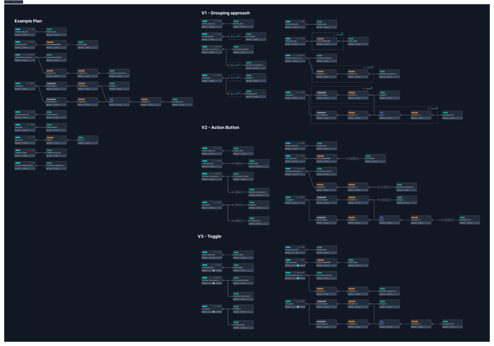
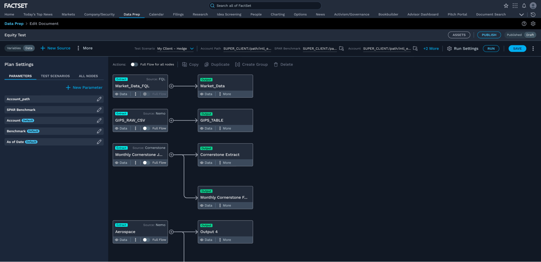
- Consolidated navigation: Unified toolbar with consistent placement across all document screens
- Unsaved state protection: Explicit save confirmation before navigation eliminates silent data loss
- Inline validation: Parameter errors surface at input time, not after submission
- Improved node visualization: Node types and states clearly differentiated via visual encoding
- Simplified plans surface: Plans hierarchy restructured for faster scanning and configuration
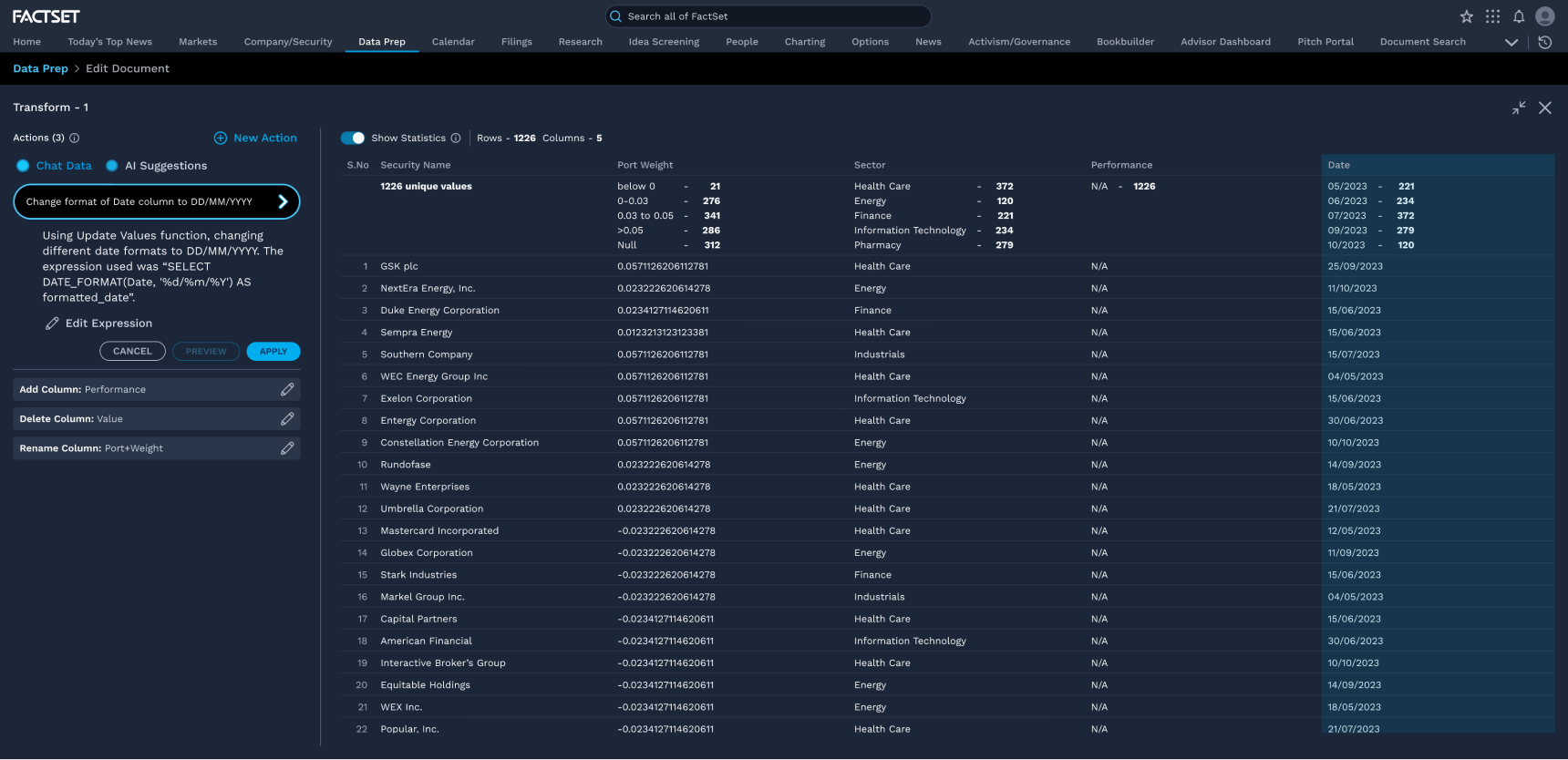
I explored a conversational interface that lets users query their data preparation pipeline in natural language — asking questions like "which documents failed last week?" or "what are my most-used transform functions?" — without needing to navigate deep into the application.
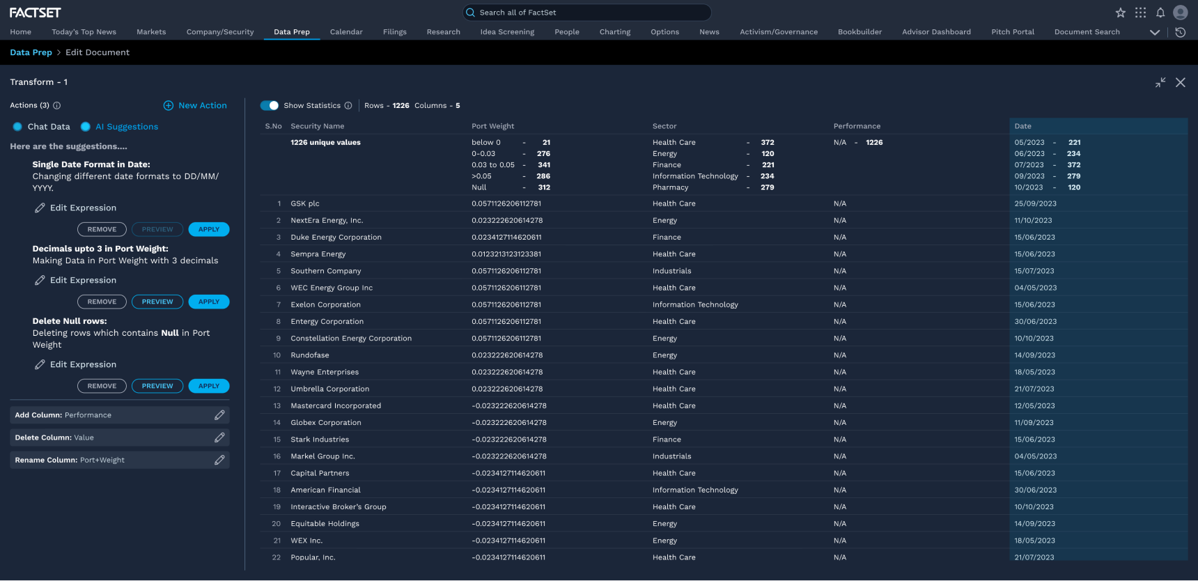
An AI suggestions pattern that proactively recommends transform functions and parameter configurations based on the user's data structure and historical usage — reducing setup time and helping users discover functionality they would otherwise miss.
- Usability validated by real users: Moderated testing confirmed faster task completion, fewer parameter errors, and meaningfully reduced time-on-task for routine workflows.
- Silent data loss eliminated: Explicit save confirmation before navigation removed the most common source of user frustration — work lost without warning.
- Engineering-built UI brought up to standard: Features that had accumulated usability debt were redesigned and validated — demonstrating the concrete impact of UX involvement.
- AI explorations aligned with product direction: Chat With Data and AI Suggestions concepts gave the team a concrete vision for where the product could go next.
View Other Projects
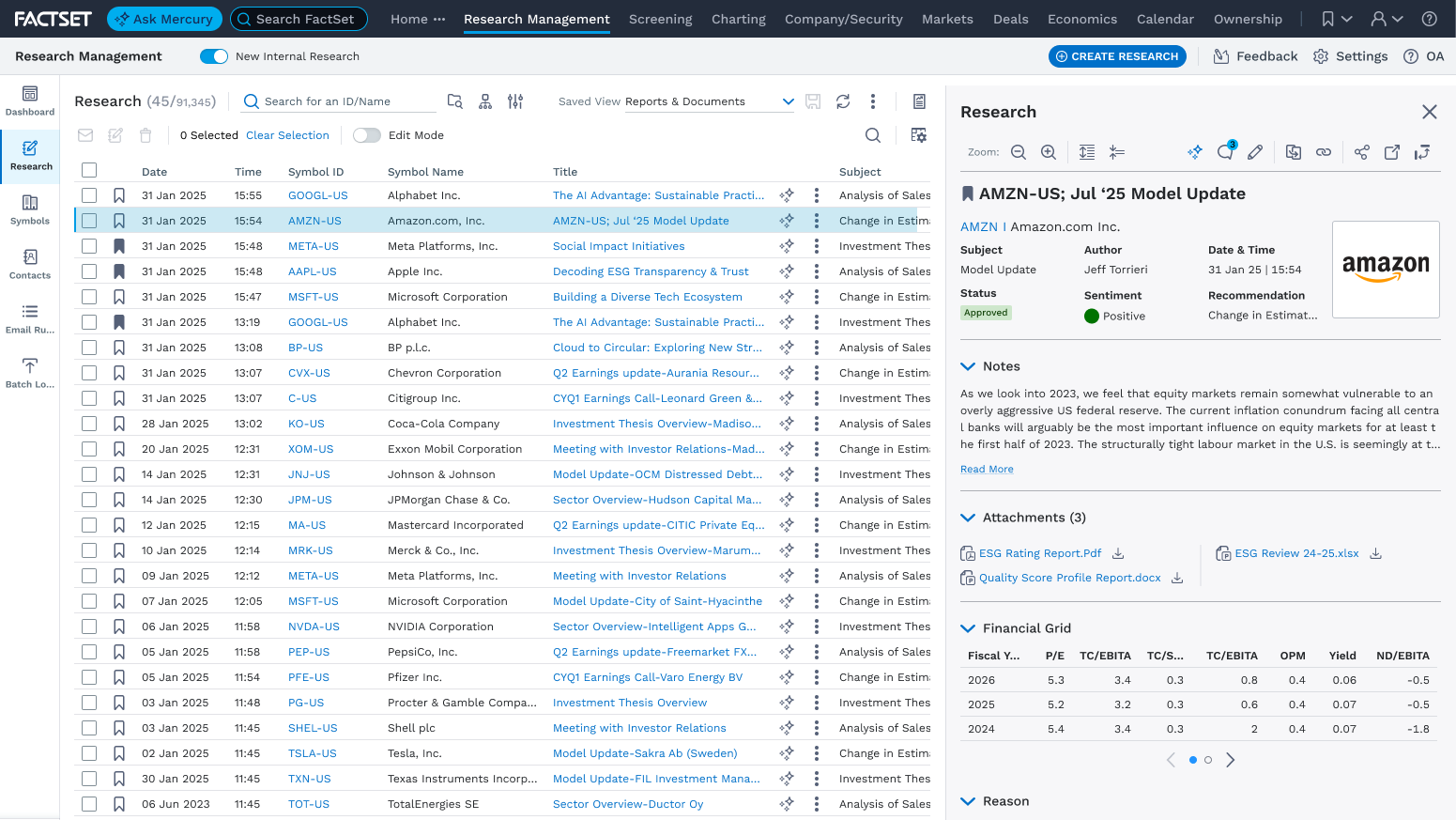
Internal Research Notes
Redesigned workflows, GEN AI integration, and accessibility guidelines across a vast research notes application.
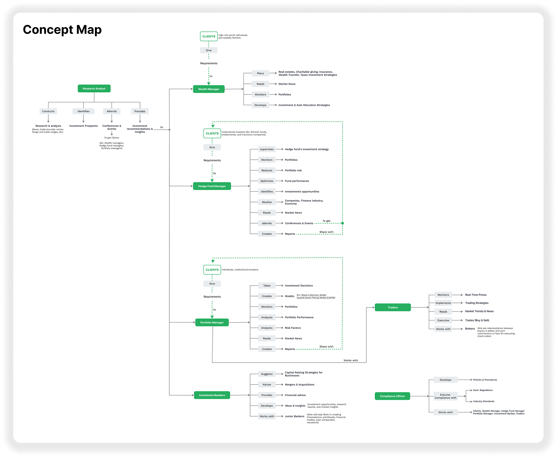
Concept Map & Competitive Analysis
Visual concept map for onboarding and competitive analysis driving FactSet navigation changes.